Exploring Your Data
Explore your data using the Input-Manager and the Input-Viewer screens
Clarifai provides an easy-to-use UI that lets you explore your data and maximize the performance of your models. The platform offers several features to help you effectively manage and optimize your machine learning projects, including:
-
Data exploration: You can upload, visualize, and organize your datasets, including images, videos, and text. The UI provides tools for searching and filtering data to better understand and manage the information.
-
Annotation: The interface includes robust labeling tools, enabling you to prepare your data for training. This includes adding labels, drawing bounding boxes, and applying other relevant annotations.
Input-Manager
If you click the Inputs option in your app's collapsible left sidebar, you'll be redirected to the Input-Manager screen, which is the main page showcasing all the inputs in your app.
On this screen, you can:
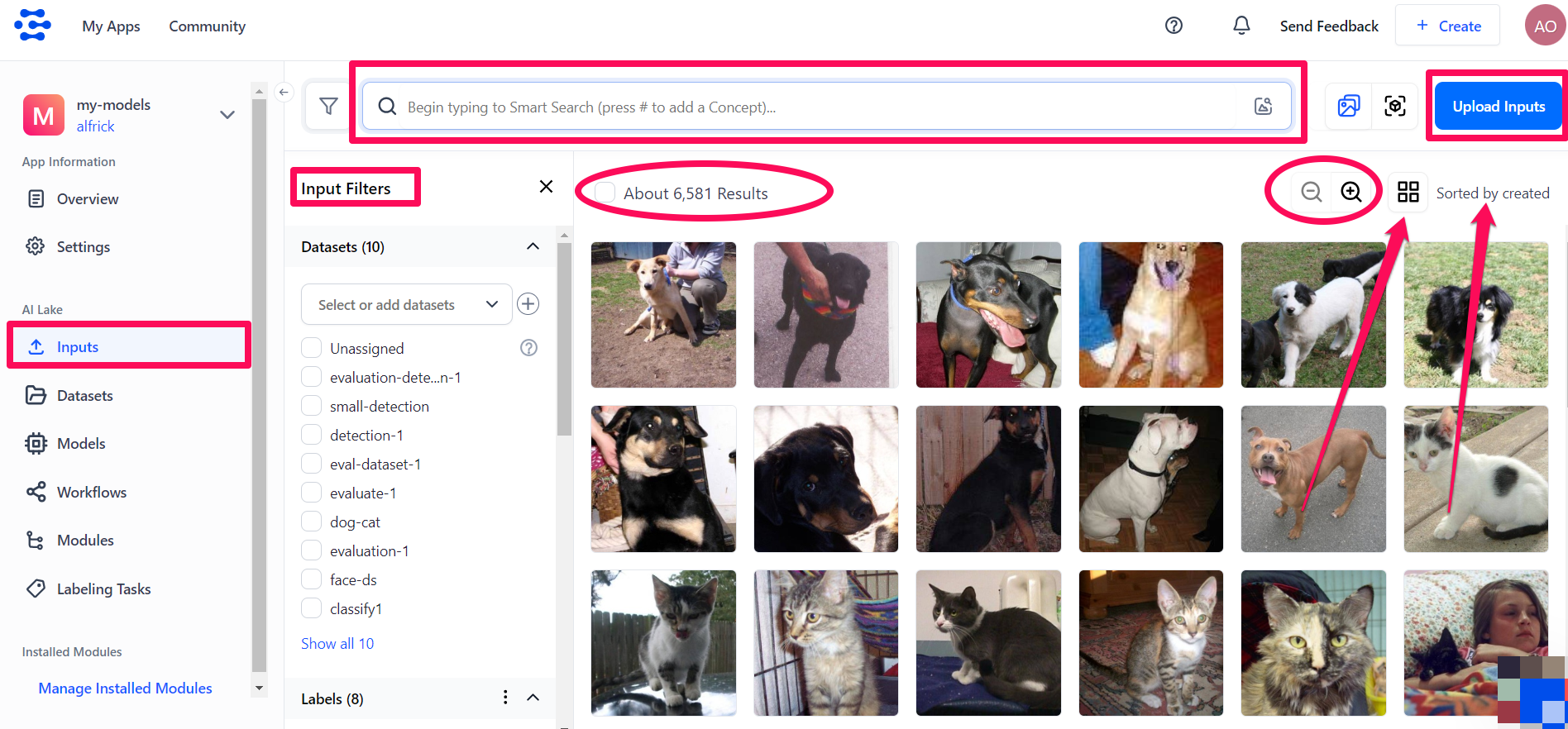
- Perform a smart search: Use the search field to rank, sort, and retrieve inputs based on a predicted match to your query caption text. Learn more about it here.
- Upload inputs: Add new inputs to your app by clicking the Upload Inputs button in the upper-right section of the page. Learn more about it here.
- Filter inputs: Use the Input Filters section to customize how inputs are displayed. By default, inputs are sorted by creation date, with the newest at the top. You can filter inputs by dataset, labels, input type (audio, image, text, or video), or metadata. The number of inputs matching your criteria will be displayed at the top.
- Zoom in/out: Adjust the zoom level of the displayed inputs to suit your preference.
- Toggle layout: Toggle the layout of the displayed items.
Input Mode
The Input Mode is the default mode of the Input-Manager screen. It displays a gallery showcasing all inputs in your app. Image inputs are shown as thumbnails, while text inputs are truncated.
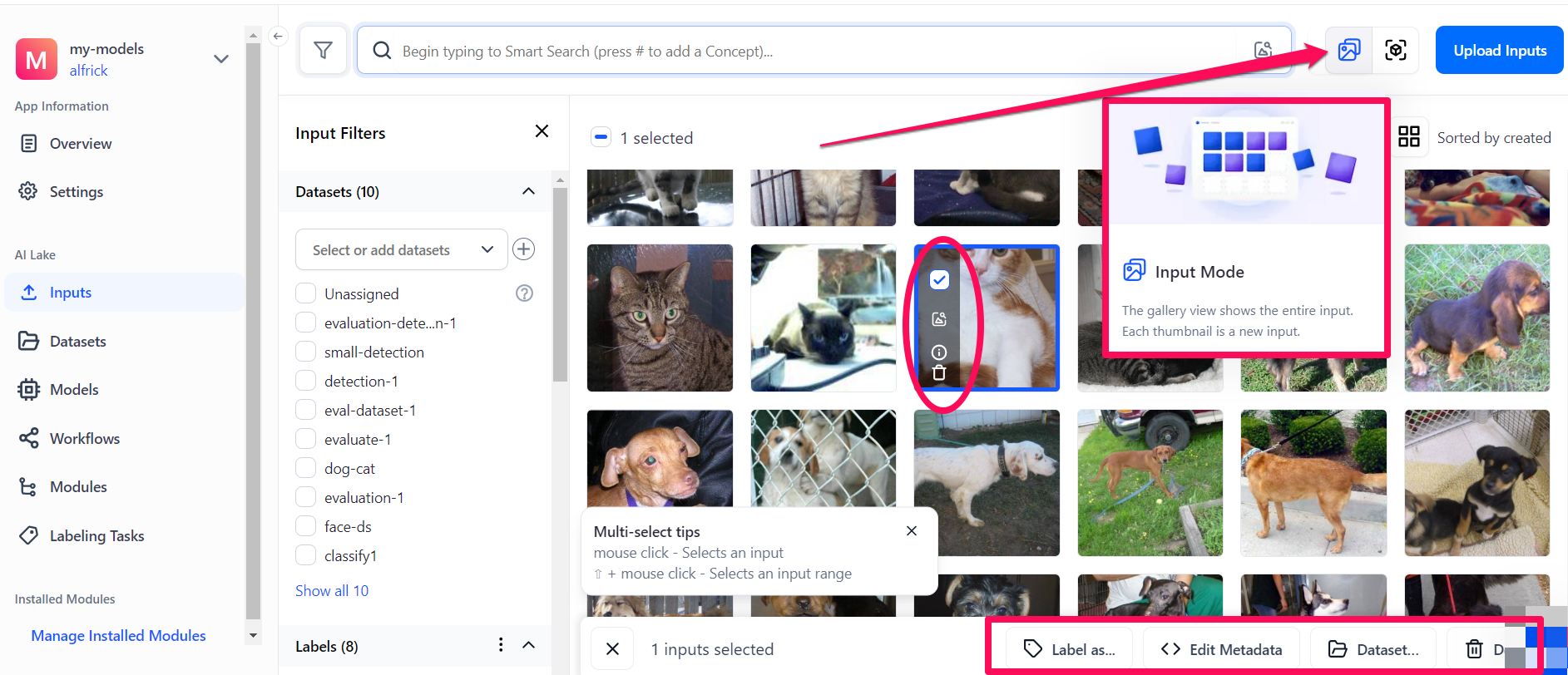
When you hover over an input, icons will appear in the left corner of the highlighted input, allowing you to:
- Click the small empty box to select the input.
- Click the magnifying glass to perform a smart search by similarity. This lets you rank, sort, and retrieve inputs based on their similarity to a provided query input. Learn more about it here.
- Click the info button to see details of the input, such as input ID, creation date, and resolution.
- Click the delete button to remove the input from your app.
When you select an input by clicking the small empty box in its upper-left corner, a section will appear at the bottom of the page, allowing you to:
- Click the Label as… button to add or remove annotations from the selected input. Learn more about it here.
- Click the Edit Metadata button to add or remove metadata information associated with the selected input.
- Click the Dataset… button to add or remove the selected input from a dataset.
- Click the Delete button to remove the selected input from your app.
Object Mode
The Object Mode is a gallery that shows the objects that have been labeled on your inputs. You can select it by clicking the Object Mode button in the upper-right section of the Input-Manager screen.
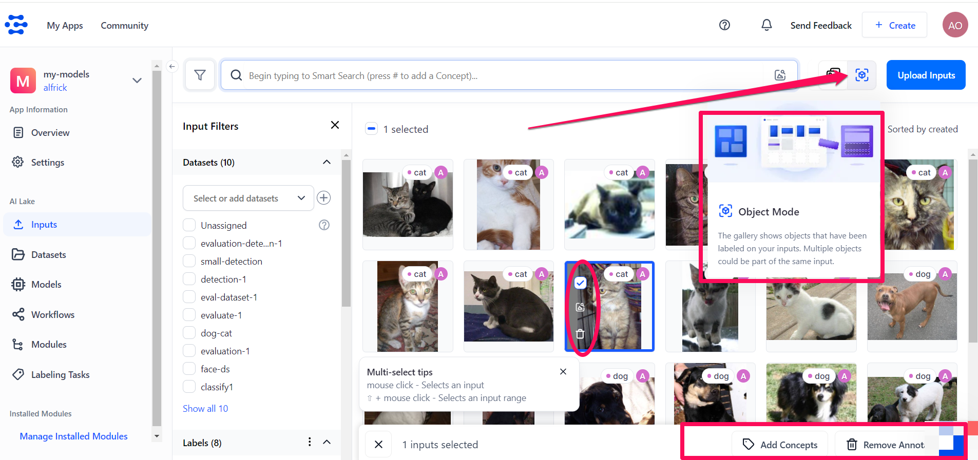
If you hover over an input and select it by clicking the small empty box in its upper-left corner, several options will appear, allowing you to perform various management tasks.
- The magnifying glass icon appearing in the left side of the input allows you to use it to perform Smart Object Search and retrieve annotated objects within other inputs based on their content and similarity.
- The delete icon allows you to delete the input from your app.
- The Add Concepts button that appears at the bottom of the page allows you to create new object annotations with the selected concepts.
- The Remove Annotations button that appears at the bottom of the page allows you to remove the selected annotation from the input.
Additionally, while in Object Mode, you can click the ellipsis next to the Labels section to reveal various options for filtering the display of your inputs. You can filter the display by: Operator — or or and, Labeler, or Status — Success, Awaiting Review, Awaiting Consensus Review, or Pending.

Input-Viewer
The Input-Viewer screen is the main interface for viewing and interacting with the details of a single input in your app. By clicking an input listed on the Input-Manager screen, you'll be redirected to the viewer page for that input.
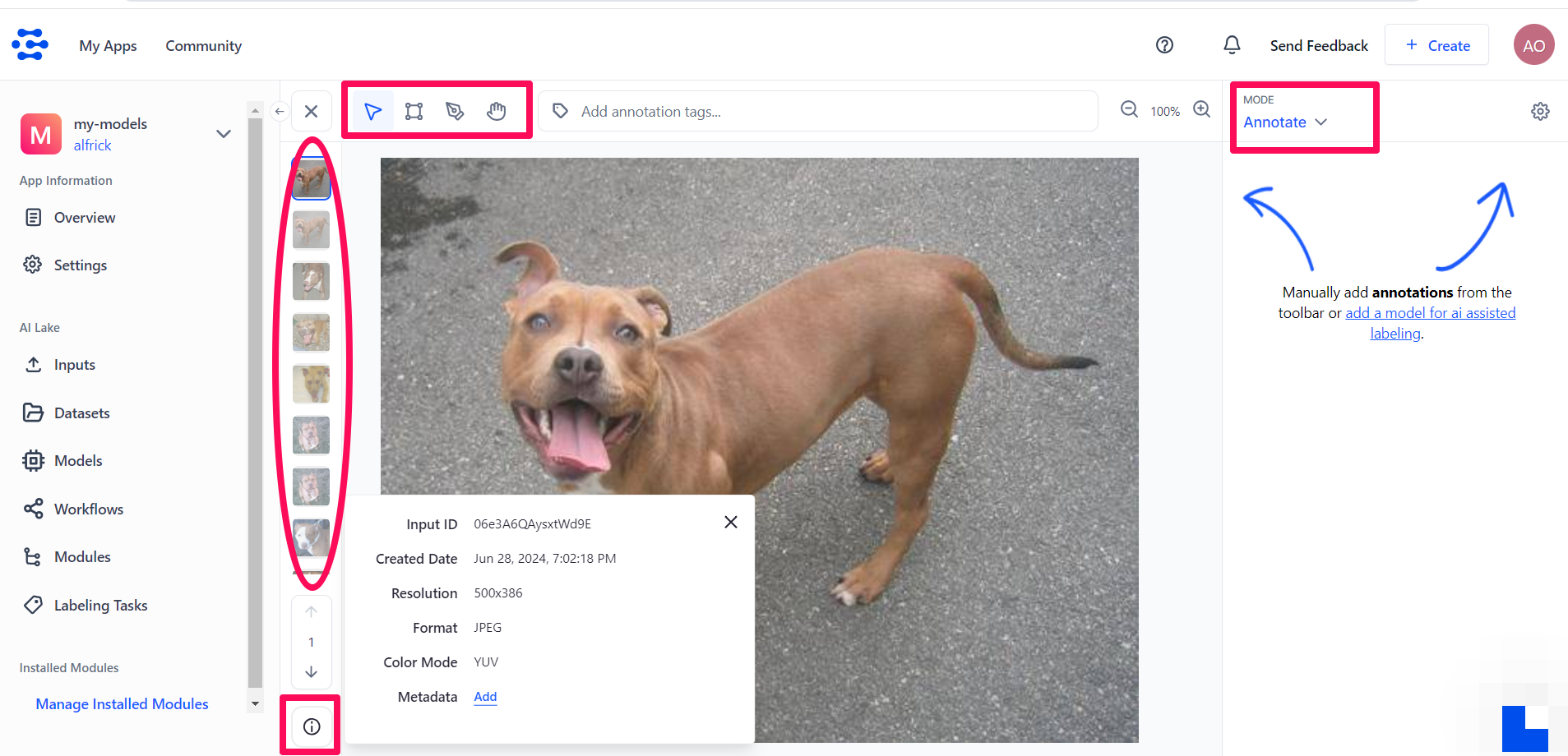
You can complete several tasks on the Input-Viewer screen, including:
- Use the assistive tools at the top of the page to manually label your inputs. Learn more about it here.
- Generate annotations for your inputs automatically using AI-assisted labeling. Learn more about it here.
- Use the carousel to swiftly move from one input to another.
- Click the info button in the lower-left section to see details of the input, such as input ID, creation date, and resolution.