Overview Tab
Get a summary of your key metrics at a glance
The Overview tab allows you to quickly access the charts and data you choose from other function-specific tabs within the Control Center.
To access it, select Control Center in the collapsible left sidebar and choose Overview from the dropdown list. You can look at the section to get a quick summary of the activities you undertook.
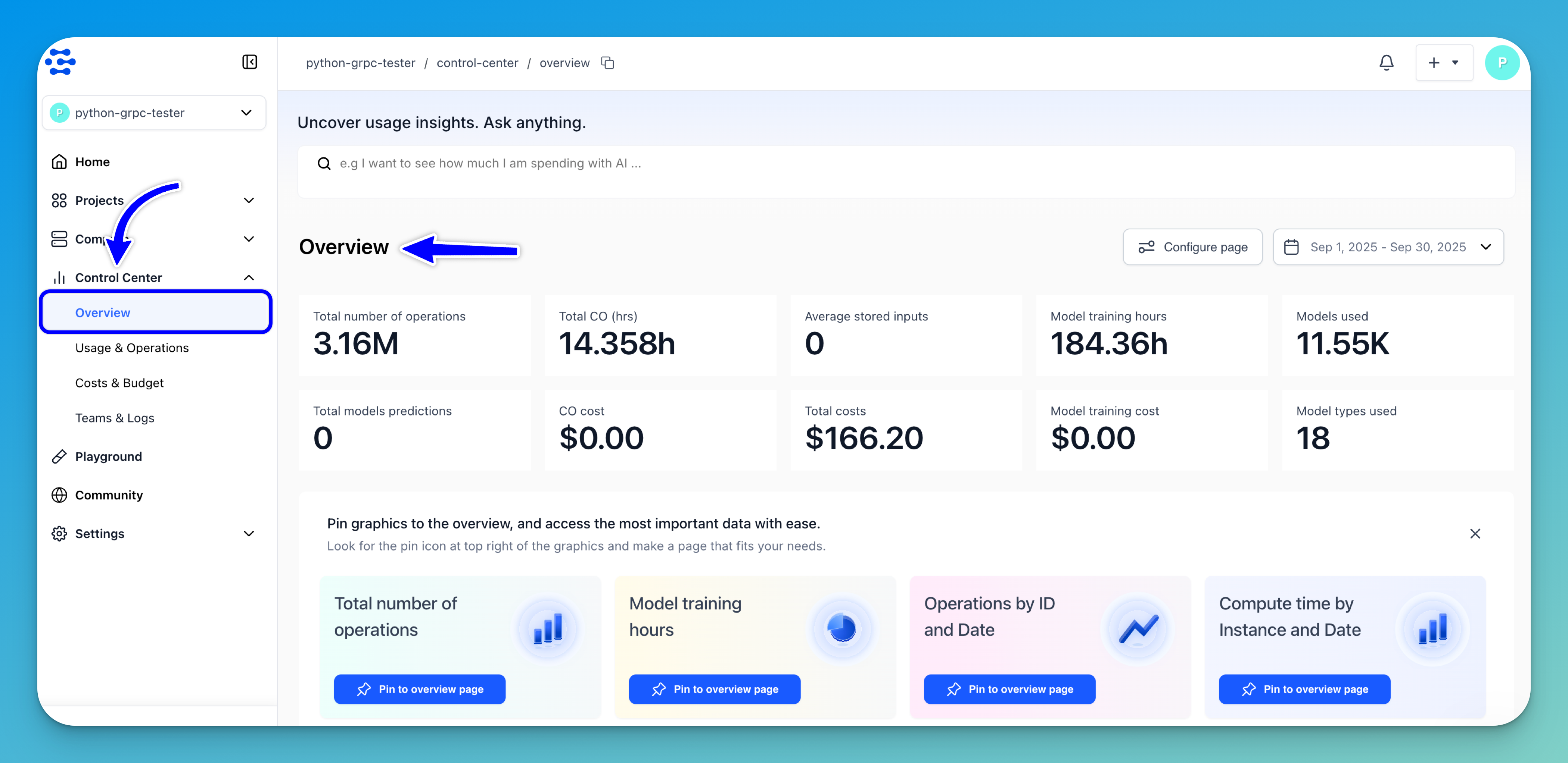
In the Overview highlights section, you can get quick analysis of how you used our platform during the selected period.
It tells you:
- The total number of operations you’ve performed; that is, model predictions and search operations
- The total compute time for Compute Orchestration (CO) tasks (in hours)
- The average number of inputs you’ve added and stored in the platform
- The total training hours of your models
- The total number of models you’ve used
- The total number of model predictions you’ve made
- The total costs of all your Compute Orchestration tasks
- The total costs of all your billable operations
- The total costs of training your models
- The total number of model types you’ve used
Smart Insights
Smart Insights at the top of the page allows you to uncover usage insights through a conversational interface. It enables you to interact with your data naturally — by simply asking questions in plain language — rather than navigating multiple reports or charts.
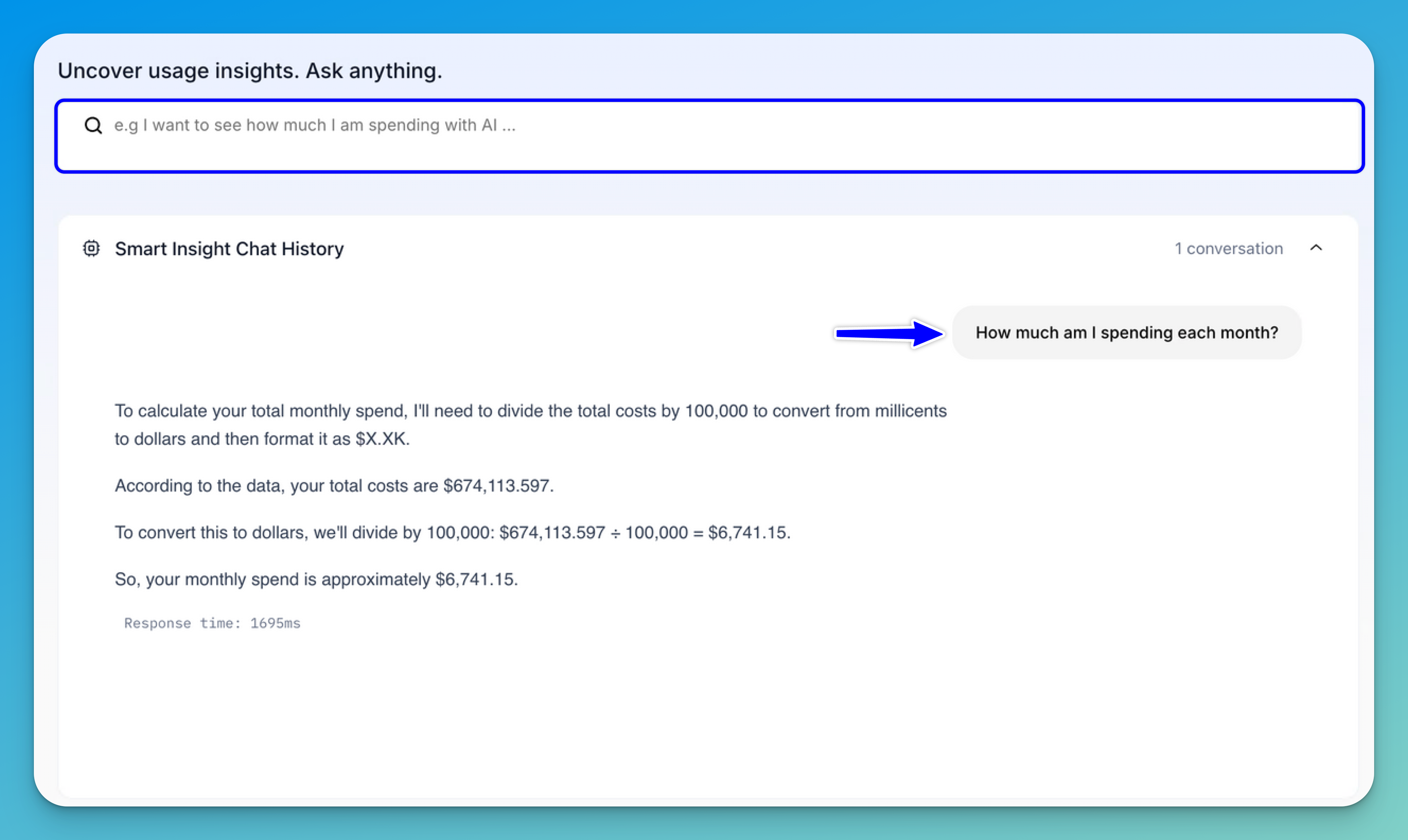
In the search field, you can type a query such as “How much am I spending each month” or any other question related to your usage, costs, or operations.
Once you submit your question, the AI system processes your query and retrieves relevant insights based on your usage data. These insights are displayed directly in the interface, which records your past interactions for easy reference.
Chart Features
Charts in the Overview and across the Control Center share several common features that make data visualization and interaction more intuitive.
Let’s take a closer look at these features.
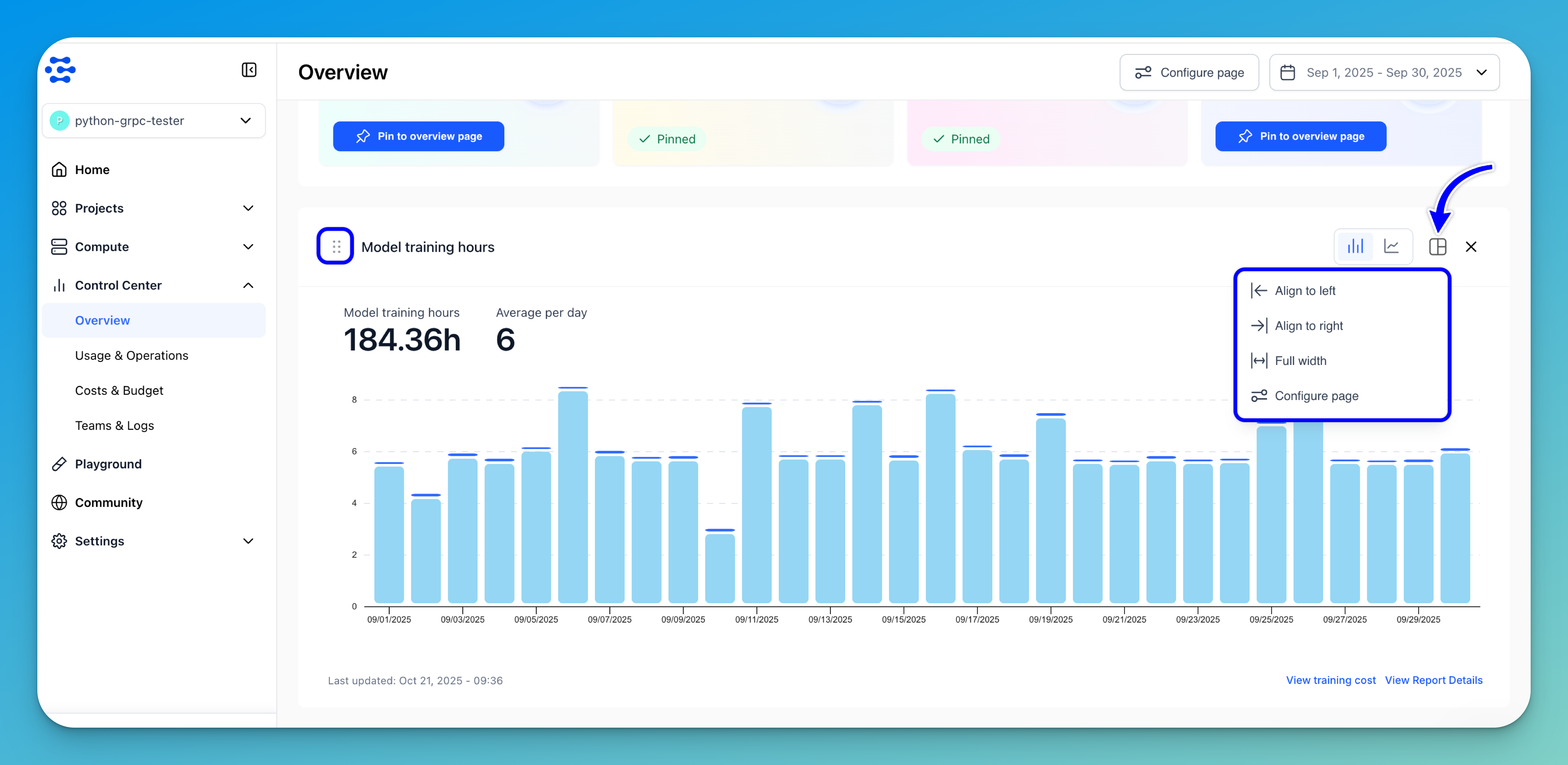
Configure Page
You can customize the display of charts on the page to suit your preferences. To do so, click the Configure page button located at the top of the page. This opens the chart configuration panel, where you can resize, reorder, and adjust the layout of the charts.
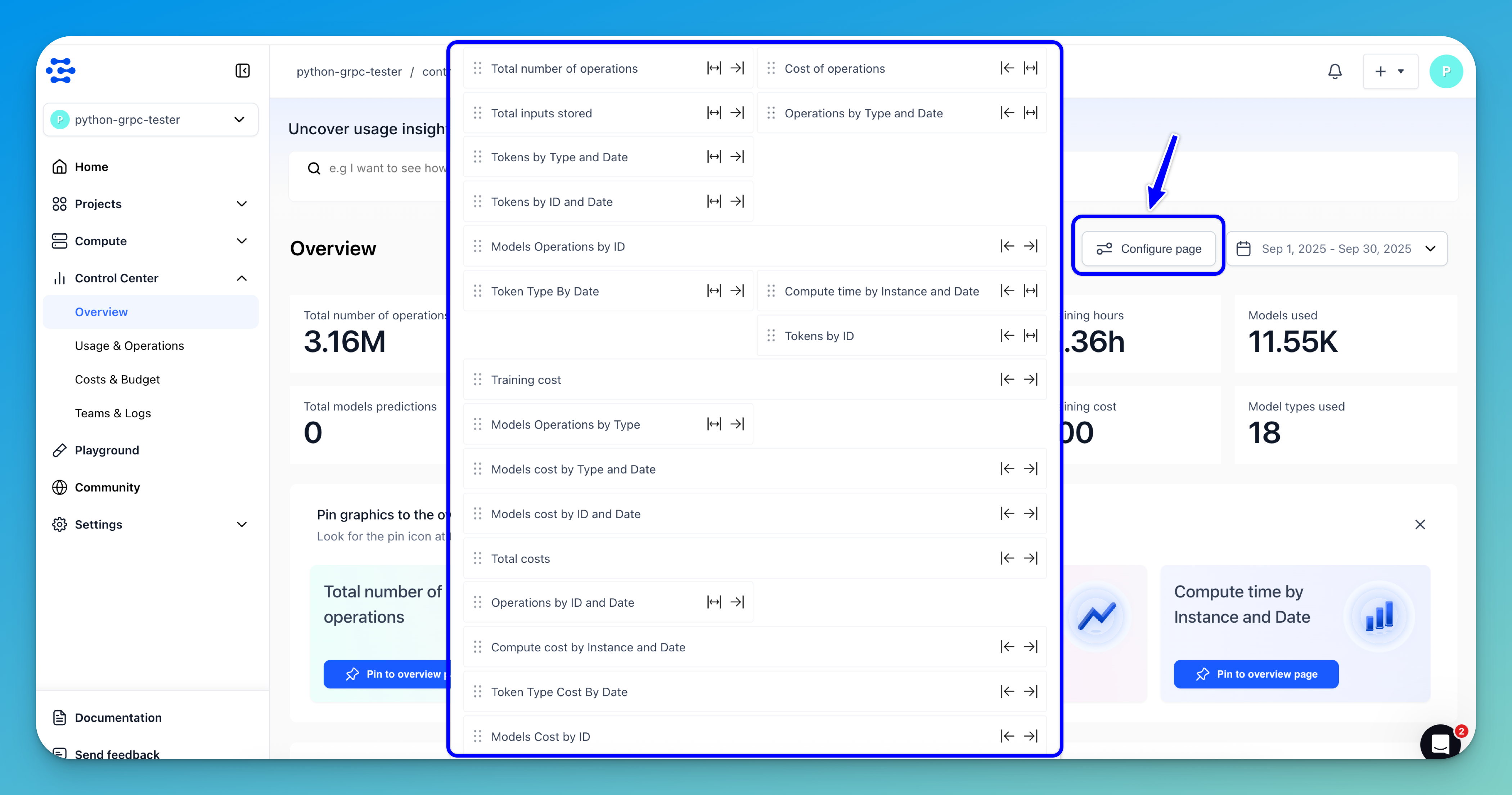
To align a chart to the left side of the page, click the left arrow (←) icon next to the chart name. To align it to the right, click the right arrow (→) icon. If you want the chart to span the full width of the page, click the double-sided arrow (↔) icon.
The alignment arrows also serve to rearrange charts, allowing you to place them side by side or change their relative order.
Charts can also be reordered easily using the drag handle (⋮⋮) next to each chart name. You can click and hold this handle to move charts up or down within the page.
Note: This flexibility is especially useful for comparison — when two charts are aligned next to each other, they automatically resize to half their original width, making it easier to view related insights together. For example, you might place the Total Number of Operations chart beside the Cost of Operations chart to compare usage and expenditure trends directly.
Once you’ve finished adjusting your layout, click the close (X) button in the upper-right corner of the configuration panel to exit.
Alternatively: In addition to the main configuration panel, each chart includes its own configuration options. By clicking the configure icon in the upper-right corner of a chart, you can use the drop-down to quickly align it to the left, right, or full width, or open the main configuration panel for more advanced layout adjustments.
You can also reorder a chart easily using the drag handle (⋮⋮) next to its name.
Date Range Selection
You can use the date range control to filter and view data for specific time periods. The feature allows you to select a range as a criterion to view the output of the Overview section.
To select a date range, click the button in the upper-right corner of the page. A small window will drop down, which allows you to select your preferred date range.
By default, the display of data is filtered based on your current month-to-month billing cycle. You can customize the output by selecting a predefined date range — from today to the last 6 months.
You can also use the date picker button at the bottom of the drop-down window to select a custom date range.
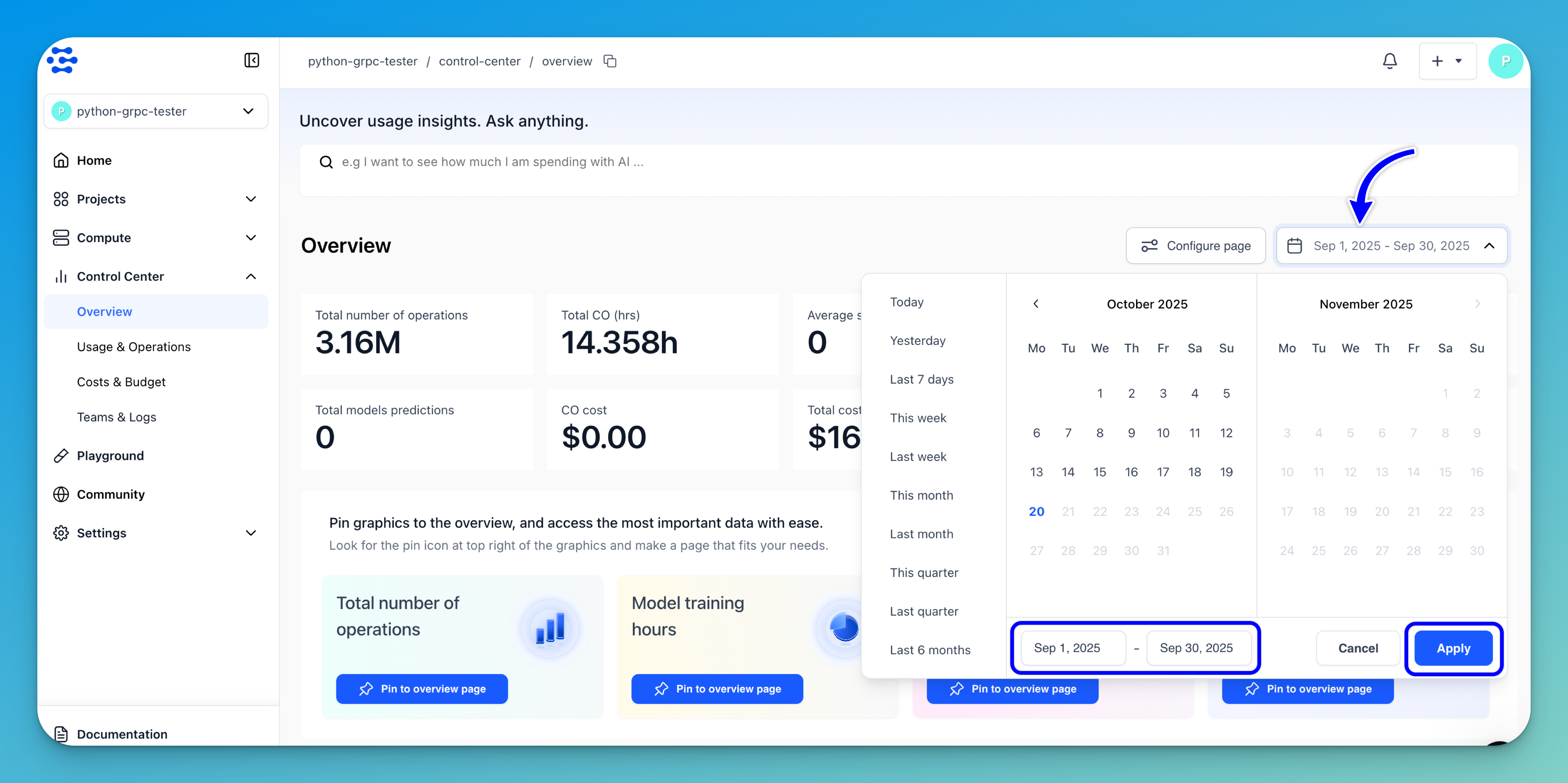
After choosing your preferred date range, click the Apply button.
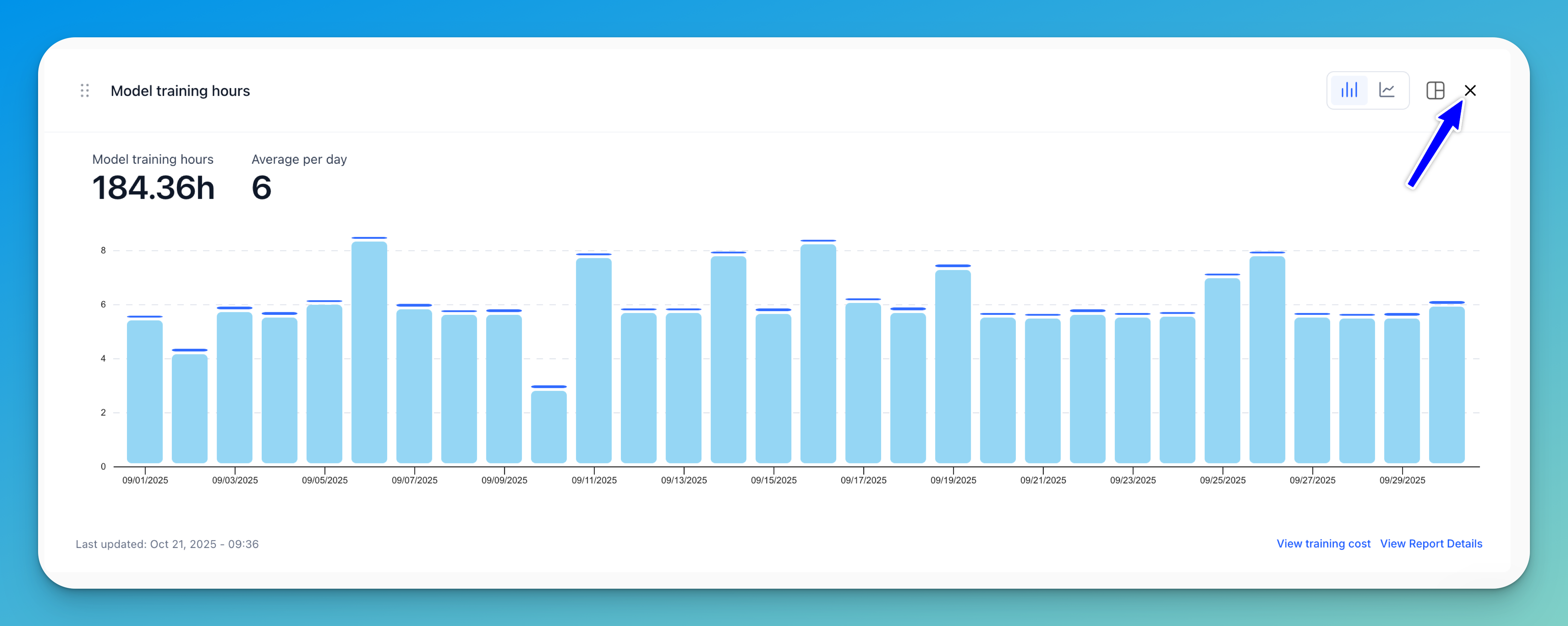
Pin Charts
Once you pin a chart from other tabs within the Control Center, it will automatically appear in the Overview.
Tip: You can also click the Pin to overview page button directly within the Overview to quickly add the suggested chart to the page.

In the next section, we’ll explore charts in more detail and walk you through how to add them to the Overview tab.
You can remove a chart from the Overview by simply clicking the delete button (X) in the upper-right corner. This action will only remove the chart from the Overview, without deleting it from the respective data section of the Control Center.
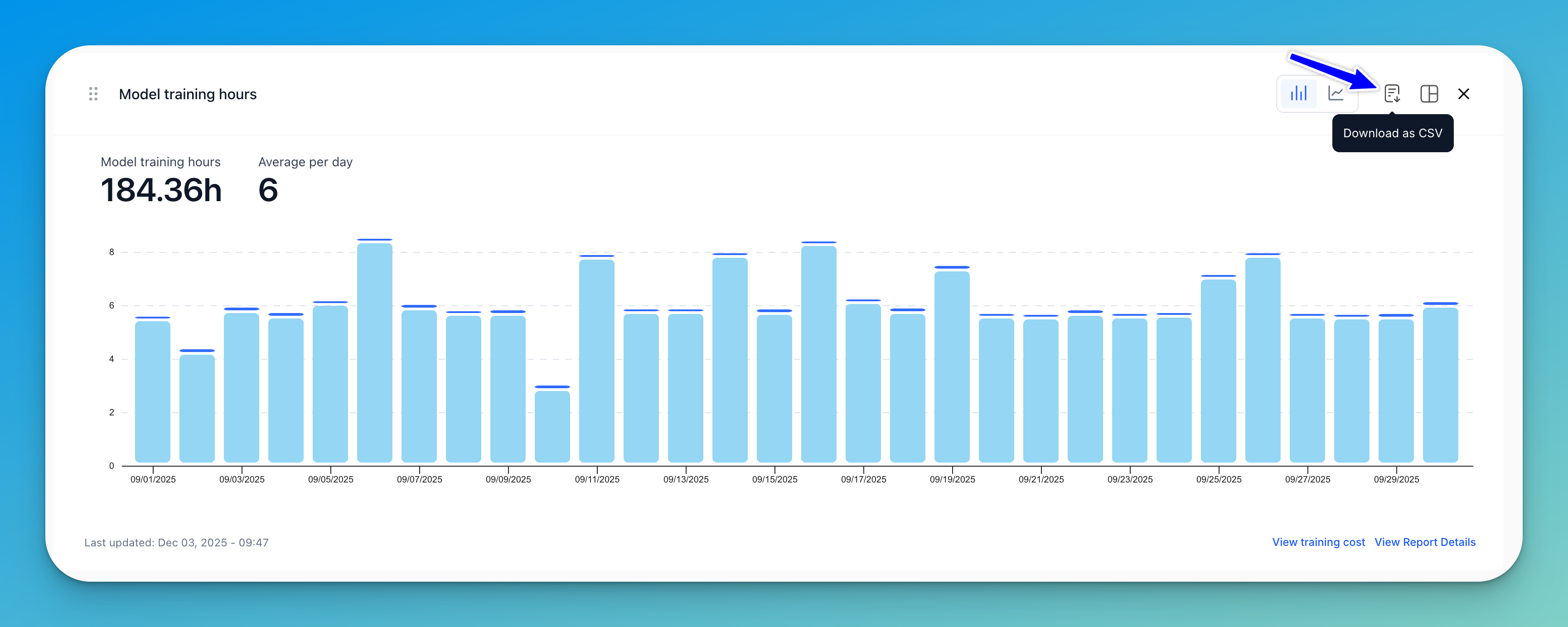
Download as CSV
Click the Download as CSV icon to export the chart data in CSV format.